Print 101: learn the lingo

by Nathan Rothfield

What is bleed?

Wait… there are how many different types of binding?

Look, we get it. Print lingo can be confusing. We know this because our clients tell us so on a regular basis.

Print management is where we cut our teeth over 30 years ago. What we don’t know about print isn’t worth knowing, as they say.

And after so long in this industry, maybe we underestimate how confusing print terms are for clients.

So, with that in mind, let’s go back to basics and demystify the sometimes murky world of printing and print lingo.

Offset vs digital

Offset printing has been a stalwart of printing for over 100 years. In very general terms, it involves transferring ink from a printing plate to a coated rubber blanket, which in turn transfers the ink to paper.

Offset printing is great for large print runs. Even with the high initial set up costs, unit printing costs decrease significantly for high volume printing jobs.

For smaller print runs, digital printing is a more cost-effective option if your quantity is small enough. Digital printing is probably what you’re most familiar with at home. You send some files to a printer and it spits out a few prized family photographs.

But in the corporate world, digital printing is also a wise choice for projects where more customisation is required within a single print run. Think names, addresses, or other unique information.

Paper stock

Whether you want us to print a book, flyer, or pamphlet, it is important to think about paper stock.

Paper stock can be broken down into three categories – coated, uncoated & recycled.

Coated paper has a clay coating & can be gloss, satin or matte. Coated stocks that are used in Australia are imported and often carry an environmental accreditation such as FSC “Forest Stewardship Council”.

When using coated paper in an offset printing environment, it is also common practice to apply a sealing varnish to enable better drying time. This aids processing such as folding and finishing of brochures.

Uncoated paper, as you might have guessed, is, well, uncoated! Printing on uncoated paper using an offset printing process allows more ink absorption into the paper given the lack of a clay coating, but with printing technology, this can be compensated to give a look that is similar to a coated sheet.

You might also be asked about GSM – or grams per square metre. This is simply a measure of a paper’s quality and weight. The higher the GSM, the heavier (and arguably more robust) the paper will be.

Embellishments

Thermography – If your project involves stationery or invitations, then thermography may be for you. This method of print involves using a powder ink treated with heat to create a raised effect.

Blind Emboss – This is a technique where we “stamp” a design into the printed piece, creating a raised or embossed area. Blind Emboss does not contain any ink or foil.

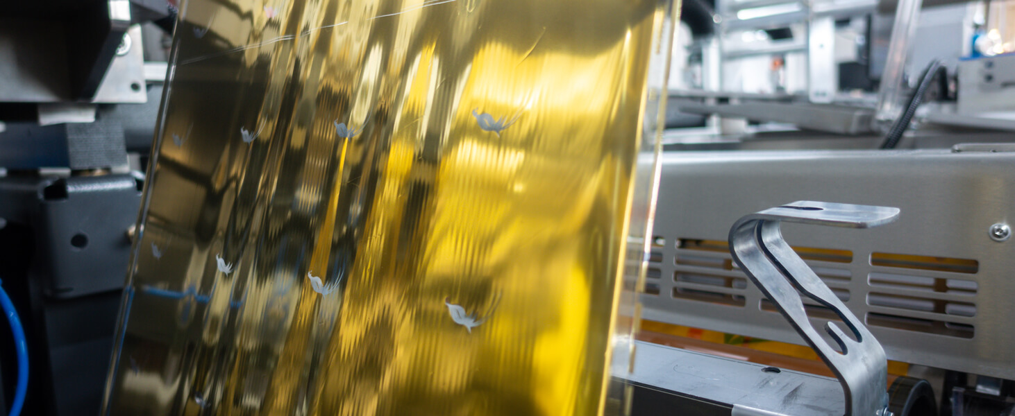
Foil Emboss – With a Foil Emboss, we utilise the same technique as a Blind Emboss – except the area has distinguishable metallic foil as part of the raised (or depressed) stamp design.

Embossed – The same stamping technique, but this time using an ink colour within the embossed area.

Deboss – Deboss also uses the same stamping technique as the examples above, but in this case the design is punched downward into the card and not “raised up”, creating a depressed area of design.

Lenticular – A process of print production that creates a 3D-like motion by morphing two or more images into one piece.

Aqueous – A water based sealing varnish process. This offers good gloss & matte finish.

Machine Varnish – Like aqueous in that it is a coating – but with Machine Varnish we can control what areas of the design are covered and which aren’t. These varnishes are applicable to offset printing.

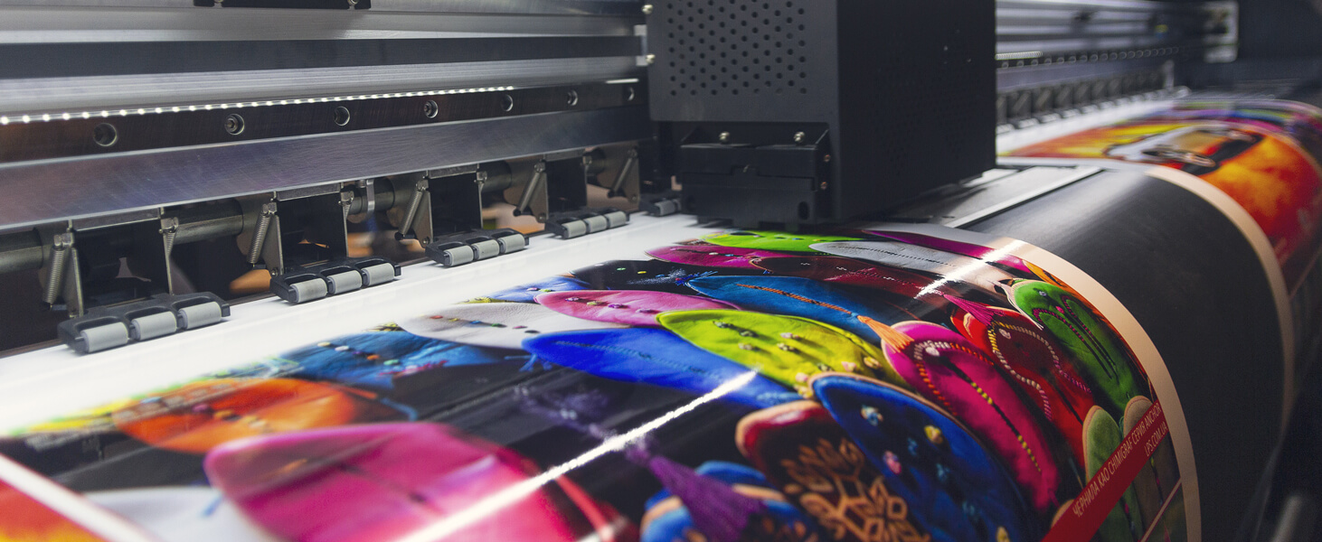
Film Lamination – To aid with the longevity of a printed piece as well as helping with various mechanical processes a film lamination is applied to a printed sheet, either offset or digitally printed.

Colour

The acronyms associated with different colour spaces are enough to make anyone’s head hurt. Many are confused as to the differences between CMYK and RBG.

But since both are used for mixing colour in graphic design, why the need for two colour spaces?

It is in their applications that the difference lies. CMYK (Cyan, Magenta, Yellow, Keyline (Black) is used by both offset & digital printing processes. On the other hand, the primary colours in RGB (Red, Green, Blue) make up the colour space that screen devices utilise in digital design.

But there is another player here – spot colour.

The use of a spot colour or Pantone colour is becoming less common. With the advent of greater colour management technology, most offset productions utilise CMYK. There are some exceptions like when a metallic colour is required (silver, gold & variants). There are also some spot colours that are not achievable using CMYK as the pigmentation can not be reached. Orange is a particular issue in both offset & digital printing.

Still with us?

Bleeds and trim marks

When we print offset or digital we use paper stock larger than the finished size.

The bleed is simply the elements of the design that extend beyond the actual dimensions of the finished product. In other words, the trim marks are where the finished product will be cut. So for example, an A4 leaflet (297mm x 210mm) with an overall image would require 5mm bleed all round with the trim marks at 297mm x 210mm.

The primary purpose of the bleed is to avoid strips of white paper showing on the edges of the finished product or having to trim undersize.

Folds

In terms of print terminology, we think folds are one of the easier terms to wrap your head around.

There are many different fold styles, but some of the more popular ones include:

Letter fold – two parallel folds are used to create six different panels on a double-sided sheet.

Double parallel fold – the final product is folded in half and then again in the same direction twice more. It creates a total of eight panels.

Z-fold or concertina – perfect for brochures and related material. The product is folded in thirds and opens like an accordion in the shape of the letter Z. This style is not suitable if the printed piece is going to be auto inserted into an envelope for mailing.

Binding

Many types of binding are suitable for a variety of needs and budgets. In fact, we could probably devote an entire article to binding alone. But for brevity’s sake, the vast majority will fall into these categories:

Wire binding – everyone has used a wire bound product at some point in their lives! Wire binding is ideal for calendars, training manuals, sales documents and other applications where lay-flat, double-sided pages are important.

Stapled or saddle stitch binding – an easy and popular option where sheets are folded and stapled together. Perfect for multiple page brochures and magazines. The page count is a factor when this method is used as staples are a particular length, so perfect binding may need to be used if the page count is too great.

Perfect binding – sections of folded sheets are combined to form the book, and this is glued to the spine and the wrap-around cover using a hot-melt adhesive. Great for brochures or other products with a high page count or where durability is required.

Case Binding or Hardcover – most of those hardcover books you read as a child were probably bound this way! This process uses endpapers, the folded sections are sewn & then cased.

Tint and transparency

The subject of tint and transparency does trip a lot of people up.

Transparency refers to images or text that are transparent. In printing, common transparencies include:

Lightening certain parts of a design so that overlying text is readable.

Making objects fade into other objects.

Effects such as drop shadows, glows and image feathering.

Whatever the transparency, it is important to understand that the colour of the transparency will interact with the colour beneath it.

Tint is a little different. Tint is simply a colour mixed with white to reduce darkness. Importantly, the resultant colour is opaque. In other words, tint does not interact with other colours.

Confused?

Consider this example.

Imagine you have a white background behind two black objects. One object has a 50% transparency. The second object has a 50% tint.

The first object is transparent and will mix with the white background behind it. The tint of the second object – although appearing a similar colour to the first – is opaque and will not change at all.

Image size vs image quality

Image size is often used interchangeably with image resolution – or the number of pixels that an image contains.

Conversely, image quality is independent of size and is instead a result of compression.

Compression is what happens when we take a high-resolution file (a “large” image) and save it as a JPEG to reduce the file size. Because we are down-sizing, pixel information must be discarded through compression – leading to lower image quality.

Phew! We got there in the end.

Hopefully you can now tell your friends what a full colour plus three spot colour embossed exposed stitched brochure is.

If the details are still a little murky, no matter. We are here to help.

But for everyone else who feels more up to speed, then it is time to get your documents ready for print.

In the next article, we’ll guide you through what can often by a tricky process.

Stay tuned for that!

Like this article? Get more of this in your inbox

Loading